8" x 10" oil on canvas

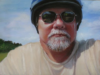
This is Bruce, our son in law on his Harley enjoying some time off! Doesn't he look like a B-AA-DD dude? Bruce is a teddy bear - but I think he enjoys looking kinda mean! Still have a long way to go and trying not to get carried away with detail.
A fellow blogger emailed to ask if my methods for detail were "secret" - absolutely not! I am always willing to share and feel that's what blogging is all about! If the email had come before starting this one, I would have documented from the beginning. My steps are to first find a photo I really like hopefully with lots of high contrast, "play" with the photo in Photoshop Elements until it's the way I want the painting (or think I do), print the photo to size in black and white, trace it onto tracing paper and using graphite, transfer to canvas or board. Sometimes the support is toned - sometimes not. Bruce was started on white canvas after a couple of extra coats of gesso had been applied and sanded to smooth out the canvas bumps.
Another in the "Shades Series" notice - no eyes, no teeth, no ears! Yea! Can a portrait subject get any better! I knew the fine lines in the rims of the sunglasses would be difficult so started there using the Prismacolor Verithin Pencils. What wonderful tools they are and totally compatible with oil paint! Next the hair on the face - I LOVE painting mustaches and beards! Every color in the painting is in those hairs but you may or may not see all of them. I worked the dark patterns with the pencils and then started painting. Later going back to the facial hair, the sharp points on the pencils were used as brushes to apply paint and then scratch into it. I'm not "afraid of the dark" even though the really dark areas (no tube black paint is used) tend to give the piece a photographic look which may or may not be desirable. Was the little crease on his neck necessary? Probably not - but this is an exercise for me and I wanted to see if I could do it!
I do not follow any formula for fleshtones unless you call "hit or miss" a formula! I keep the photograph on my monitor as I paint and try to match the colors I see, but am more interested in the warm and cool tones and value shifts. The Sandin ProMix set is helpful. I don't use any of the tube colors alone but do use some of them in mixes. The three tubes shown are favorites. Neutral 3 is helpful in achieving good color for teeth. I was introduced to the Rembrandt oil transparent oxide colors brown, red, and orange by David Darrow and will always have these colors on my flesh palette. Love them!
Our critique group meets Wednesday and it will be interesting to see what suggestions are made. I will then finish and post again. I don't always work this way but for these small family portraits, it's a fast way to get past the drawing and to the easel!
Linda, I do hope this has been helpful and I appreciate your interest! Please let me know if you have more questions.
Bruce - whadda think?


